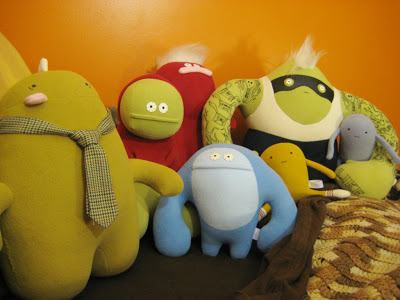
This is a weird review to start on. Historically I’ve been an action figure collector and a fairly mainstream one at that, so this isn’t an ideal representation of my main interests. It’s always been G.I. Joes, Superheroes and Sci-Fi stuff for as long as I can remember. A couple years back I discovered the Kidrobot site and realized there was an art toy movement starting to emerge. While I find a lot of it lacking good character design or creative concept, a few pieces seemed to float to the top. Strangely enough these were plush. The bizarre, simple characters from Friends With You were appealing and, yes, cute. They seem to be self aware regarding their cuteness and didn’t over do it with too much pink, stupid smiles or big dough eyes. Ugly Dolls are another early example of this formula.
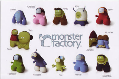
I first heard of Monster Factory while checking the Magic Pony website. Magic Pony regularly has art shows and product launches and Monster Factory were having an event celebrating their latest series of Monsters. I followed some links, did some googling and found their site. Their monsters took all the best aspects of modern plush, mixed them together and pushed it to new heights. Being so entrenched in action figures it took me a while to actually take the plunge and buy some.
Finally I used Valentines Day as an excuse, buying a heart themed character for
It was also very inspiring to see a company producing toys, by hand, in
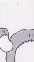
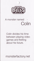
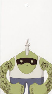
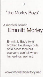
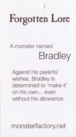
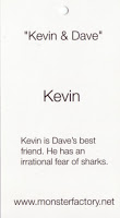
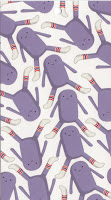
Even though these are hand made locally, they have gone to great care to make them feel very professional. They come with two tags affixed to them. One is a general Monster Factory tag and the other is a character specific tag with an illustration of the character on one side and a short write up on the other.
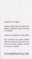
I snipped these off but kept them in a safe place. They also have the standard tags sewn into the seam, one is fabric with the logo on one side and other side has info on the fabric, “made in” and washing instructions. The other is a coarser larger tag, which I found to be quite ugly. I carefully snipped this off each of them. It had no relevant info from what I can remember, just that it was made from entirely new materials. I remember reading somewhere that they have been approved by toy safety standards, so these tags are most likely included for legal reasons. I kept the logo tag because I see it as a signature by the creators and would feel strange removing it. Another interesting detail is that when you pick them up from their studio they give them to you in a clear plastic bag. Whether this was out of convenience or not I'm not sure, but it is a smart way to further advertise your product
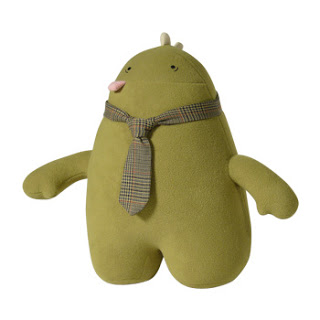
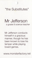
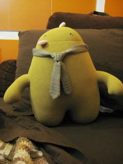
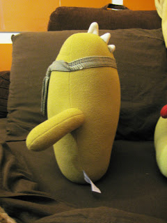
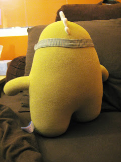
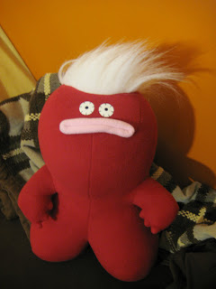
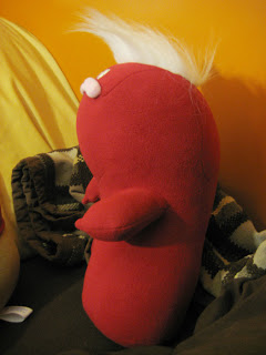
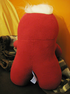
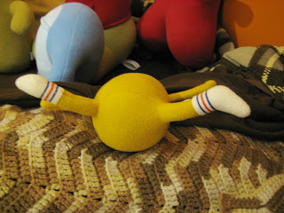
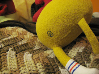
Mr. Jefferson was the first monster to catch my attention. As you can see in the pictures he has a very simple body structure. There's two structural choices that I find interesting. They chose to have his arms as separate pieces of fabric instead of it just being extensions of his main body shapes. This makes them seem more significant and strong and encourages the handler to hold him by the arms. I also like how his mouth is hinted at with just a seam and a small pink tongue is stitched into it. The tie is of course what really sets this character apart. I have a personal distaste for ties, so seeing a goofy monster in a tie, somewhat making fun of it, is satisfying somehow. The tie is tacked at the back and sides, but tends to ride up in the front making some awkward folds in the fabric at the side tacks. It's minor, but I would have like to see the tie tacked in more places to avoid this. His colour is also a very mature choice. This is something that runs through most of their line. They could have gone for a vibrant green, but they chose something just slightly off and unexpected, which is refreshing. It shows confidence in their design to not rely on the obvious.
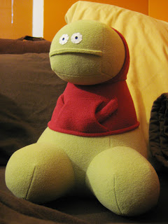
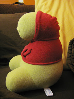
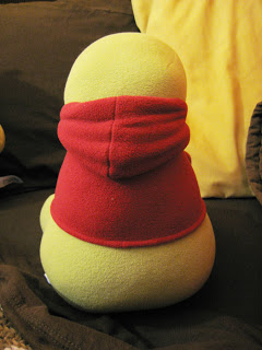
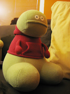
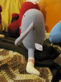
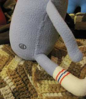
Colin is apparently a fan favorite and I can see why. He seems to have the most function and the most complex structure of all the monsters. He's posed in a sitting position which makes a nice
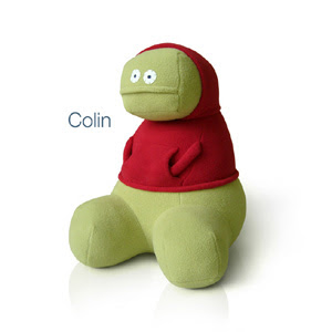 contrast to a lot of the other characters. His hoodie is fully functional apart from not being removable. The hood can be pulled down revealing a bald head and his hands fit snugly in his front pocket or can hang at his side. While this is hardly an action feature, providing these functions seems like it gives the character some depth. Most other toys of this sort would have those tacked in place, but they go the extra mile. Another subtlety I only noticed after looking at him for a while is that his torso is slightly twisted so that he isn't perfectly symmetrical. I find this adds just a little bit of life to what could have been a fully static pose. It's a detail that shows a lot of thought was put into him. My only gripe is that he has a flat spot that connects his butt and his back. This shape makes him want to roll back on most surfaces. It's a minor issue that can be compensated for with a little squishing.
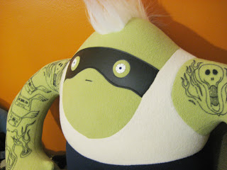
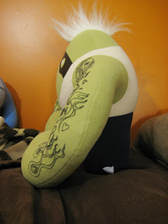
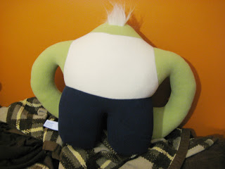
Emmitt is one of the larger monsters and is clearly quite a bit of work to produce. He has a lot of different elements to him, from the tuft of hair, the pleather mask to the tattoos. I'm not sure
how they got the tattoos on there, but they seem
even though he already has a variety of materials, I think he needs one more. His tank top is the same sort of material as the rest of him. While this works well for Colin's hoodie, I find it distracting and unconvincing as a tank top. A regular cotton t-shirt material or even a knit, like a standard "beater", would have been much more satisfying. Also instead of having a standard
seam between his flesh and the shirt, a ribbing similar to Colin's would have separated the shirt better and made it more convincing. I'm sure they had their reasons for not doing this, he is already one of the more expensive monsters, but I think that one more detail would have elevated him from a good to an excellent.
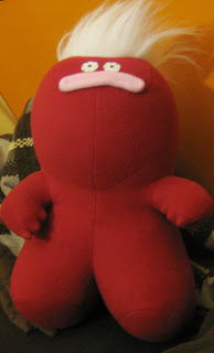
Bradley seems to be a successful experiment with complex form. I'm not a seamstress, but I'm amazed with the planning and calculations or trial and error that must have went into his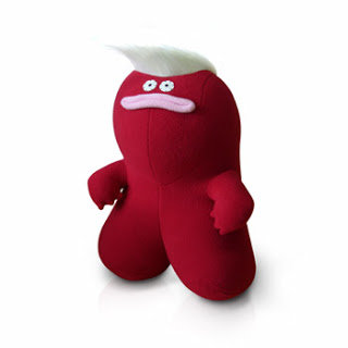
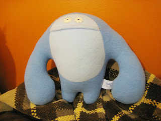
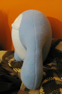
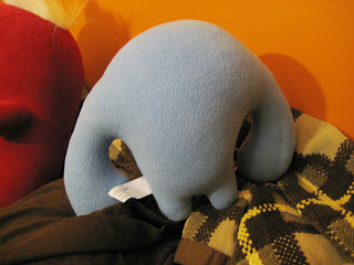
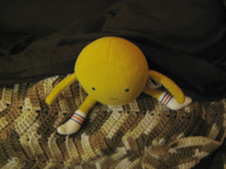
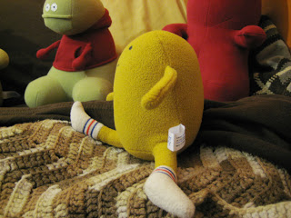
Owen is a nice simple design that adds some variety to the group. His basic form is similar to

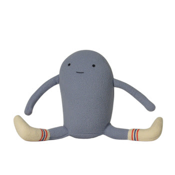
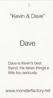
Kevin and Dave are almost identical styles, which is something I wanted to avoid, but they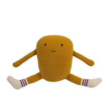
A crit for all the characters who have whites in their eyes; I’m not sure why they chose to use dark stitching to attach them. I’m aware that this is some sort of plush esthetic, Ugly Dolls also handle their eyes in this way, but I’m not sure why. It doesn’t bother me to the point of distraction, but I do think they’d look slightly better with white stitches.
A factor I didn’t talk about but that you can see in the scans is the way that they create vague personalities for each individual. This gives you just enough info to start forming a feeling or attachment to the character in your head. One of their more popular characters, Kevin, is probably as successful as he is because they’ve pushed his character a little further. This was done through a series of sketches posted on the website from his sketchbook and a music video depicting his vivid imagination. All of this and much more, including a multitude of other monsters can be seen and purchased at www.monsterfactory.net.